Past Website Designs
Zelda Xtreme has had a long history behind it and one of my favorite things about developing Zelda Xtreme has been designing its many layouts over those years. Unfortunately, a lot of these layouts were lost to the Internet's archive, but I did manage to recover a few that I had saved many, many years ago on an old CD-R that was lying in a closet under many boxes. I hope in the future to have many more listed here as they signify what we were and how far we've come.
We started at Homestead.com back when they offered free hosting and site design tools before moving to dekutree.com and then to our own paid hosting as the site expanded. Below is just a small taste of the site changes over the years. The designs I found were some of oldest and generally more well established designs that we had. If you were one of our regular visitors many years ago, some of these just might be familiar to you! Let us know if you remember these, or if you remember others that weren't shared here.

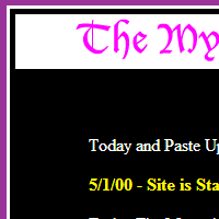
This was the original and I believe only design that we had while hosted under the dekutree.com server. Ignore the title image as the original is one of the many things lost in time. Ahh the good old days of black and neon green or red being the main colors of fan sites.
A lot of the Zelda fan pages in those days used to highlight different content links and put words next to those links to draw attention to certain features of the website.
During this period, we only covered Ocarina of Time content, which all the links in this image are in reference too.
The Mysteries of Hyrule was a design I never really launched. It was just basically a color swap of the design above that was going to focus on Majora's Mask (Zelda Gaiden at the time).
The disconjoined part hanging on the right was meant to be the main navigational menu and was made entirely in flash. Flash being one of the more popular website effects of the time. HTLOZ made great used of the flash on their website, which is probably why I tried to make my own for this design.
I believe this is the farthest this design ever achived, before being canceled in favor of a more traditional route.
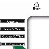
Our first layout after our move to Zeldaglitches.com. This layout heavily used frames, which have gone out of style over the years due to the push in SEO and mobile devices. This was also when we expanded to cover all the Zelda games that had been released so far. Largely, this was one of my favorite designs as it was mostly clean, hover over images was new to me and worked well and all the content was very easy to change due to the frames in use.
I remember coming up with this design in the early hours on a summer morning, after not being able to sleep all night. Something on TV inspired me to come up with this design, but I don't remember what it was. It does has a questionable font choice for the website logo now that I look back at it. We also experimented with a "preloader" of sorts that would redirect you to a page to load all the images before your first visit to the website. Live Radio was also a feature of the website then, as it is now.
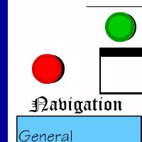
Another flash attempt/concept that never really got off the ground. This time almost 75% of the page was flash based, with all the navigation being flashed based. Only the content itself was still regular HTML.
I still have the full version of this website saved, but I like this image as it really hits home with the time period as this screen was taken on August 28th, 2000. Windows 98 in all its glory with dial up internet and PAGOO running in the task bar to receive phone calls while we were on the internet.
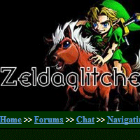
This was the second design of Zeldaglitches.com and by many accounts, one of the most favorited among the regular members. This site used some flash for navigation, but in a much less degree than the flash based attempts above. The design also had much more navigational options than previous designs to help users find their way around the website.
This is the first time the site had a drop down menu for a music player. This design also brought back the dropdown navigational menu that was used in the original layout when we were on Dekutree.com.
During this design is when our forums really started to take off in popularity and a lot of our users during the time (some of which are still around today!) were upset when we moved off this design.
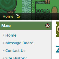
This was the original design of the rebooted ZeldaXtreme.com after reacquiring the domain in 2012. The design was tweaked over time, with little changes here and there. Originally the design had a column on the right side as well, and the design was fitted to the left side of the screen. Originally there was no mobile layout incorporated, which was added in later.
At the bottom of the layout was a mp3 player, and it incorporated the original hit counter that was on the original Zelda Xtreme - although remade in a script since the original hit counter's company had long since vanished. Below the hit counter was an animated triforce, one that had to have been made in the late 90s, as a way to pay homage to the old Zelda fan sites of yore.
The intention of this design was to mimic and bring back the feeling of the old days of Zelda fansites and really websites in general. I didn't want to load it down in heavy scripts and stylesheets as I wanted it to feel as "light" as possible. Most of the time spent on the design was towards optimizing every little thing I could to get that balance between fast and retro. Unfortunately since the goal of the design was to mimic old websites, there wasn't any thought put into mobile optimizations originally. A lot of things had to be hacked together, or outright redone, to get the website to work on mobile, and it was never quite as good of an experience as I wanted it to be for that platform as many pages still had some issues.
So there you go, there is a short history of our site changes over the years.

